Hello

Welcome to my blog, a place where I can lose myself in a crafty haven. Pull up a comfy chair grab a cuppa and come and have a read. Oh and if you like what you see, stop by and leave me some love in the comments section

Followers

Showing posts with label Pop tone. Show all posts

Friday, October 27, 2023

Gnome Matter What

 Good morning, It's been a while since I posted but I have lots of crafty news to share over the next couple of weeks so stay tuned!

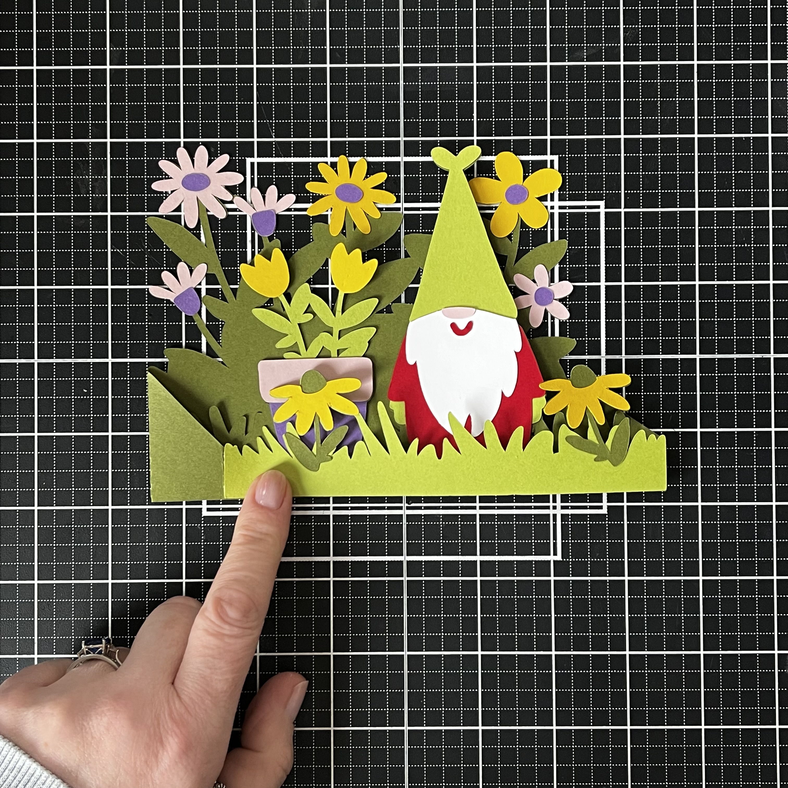
My post today is using CutCardStock products o make this adorable Gnome card:


I used Pop-Tone cardstock in a variety of colors to build the gnome which is a die plate from Gina Marie Designs.

Once I had him put together I made him a background. using Neenah Classic Crest, a Cloud Stencil and some Tumbled Glass Distress ink I created a sky.

Then tearing Brown Bag Kraft Cardstock and inking the torn edges with Brown Corduroy gave me the ground for him to stand on.

I curved a sentiment, holding it in shape using my Misti and stamped this in Momento Tuxedo Black Ink.

Finally I added the whole design to a top folding A2 card base made from Pewter Grey Cardstock adhering it in place with foam tape to give some dimension to the card.


Friday, May 26, 2023

Sunflower Frame

 Good morning!!! It a holiday weekend and the weather is looking great for it. Memorial weekend marks the unofficial start of summer and the flowers in our yard are starting to see this.

I love flowers and sunflowers are one ion my favorites so when Design Bundles had this frame for free of course I had to use it.


It is made by layering 8 pieces of cardstock with either foam tape or wet glue. I used Pop Tone cardstock from CutCardStock for the main layers. The top Layer is Neenah Solar White to give it a bright white finish.


I love how the detail of the petals pop because of the different shades yellow and orange.


Thursday, May 11, 2023

Masculine New Home Card

 Good morning! Spring is finally here! I'm staying a little quiet about it though because I don't want to tempt fate 😋

Do you struggle with masculine cards? Then read on, my card today is for a man that has moved in to a new home.


I decided on a night themed card and ink blended my sky with Distress Inks. It started life as a piece of Neenah Solar White cardstock but ends up being saturated in the ink.


My row of houses was cut twice, once from CutCardStock Pop Tone Black Licorice and once from Lemon Drop.
The black piece was adhered to the card and the waste of the yellow one was placed in the windows of the black one giving me the look of lights being on


As it's night time I used Copic Opaque White to add stars.


My sentiment needs to be bold so I cut New Home 3 times from Neenah Solar White and stacked these tin to of each other.


Building the card was easy. I used Classic Crest Epic Black in 130lb for my cardbase. This gives a sturdy frame. 


My Topper was adhered flat to this and my sentiment placed above the row of houses. I did notice I had a black smudge that I couldn't cover with my sentiment. Male cards don't generally have embellishments on so I used a White Gelly Roll Pen to add more stars - covering the smudge!


Thanks for stopping by and hopefully you gained some inspiration for masculine cards.

Friday, March 10, 2023

Gnome in a Box Garden

Hello, I've been a bit quiet on here but have still been crafting in the background. We are suppose to have a snow storm today so I'm catching up with things while keeping warm.

My post this morning is to showcase this super cute box card:


I made it using a Silhouette Design Store cutting file. The card stock I used is Pop Tone from Cutcardstock. This card is extremely affordable and comes in a rainbow of colors. These are the ones I used today:


After cutting all the pieces the box was easy to construct only needing TomBow Mono Glue to add the decorations and glue it together. Score lines are added by the cutting machine which makes it easy fold.

Oh and once the glue is dried the card folds flat so it will fit in a 5x7in envelope.


It then just pops back up again once you let go! The depth gives it stability to stand on its own and separates the layers enough to make it have a 3D feel.


Hope this has given you inspiration for your own paper crafting!

Thursday, December 1, 2022

For We All Like Figgy Pudding

Hello! It's December which means Christmas is almost here. How are you doing with your shopping?

Coming from the UK we always have something called Christmas (figgy) pudding for dessert following Christmas dinner. It's a steamed dark pudding rich in fruit that is usually round in shape - Just like on my card.


I need all my die cuts to start the design so using Gina Marie Designs Figgy Pudding dies I cut the main pudding from Pop Tones in Hot Fudge. The cream is using Neenah Solar White 80lb. The holly is Pop Tone Jelly Bean Green and the berries are using Pop Tone Wild Cherry.


These colors are perfect for both for a Christmas design and for the pudding!

As the pudding is full of fruit I added marks with a black Copic Marker. This doesn't achieve the look I was wanting so I changed it up as you will see lower down.


The card needs a sentiment so using Wild Cherry and Simon Says Stamp Holiday Words On A Line I die cut Joyful Wishes. I am now ready to build mat design, this is a landscape card. A Classic Crest ReCycled 100 Bright White A-2 Folded Card is perfect.


I like to have mats on my cards I think they give the card stability. So I cut a mat of Wild Cherry and another from some design paper I have in my stash.


Wet glue is the best adhesive to add mats to the base, this gives me a little wiggle room to get them straight.

My sentiment is just less than an inch from the bottom of the card. Trimming the excess line so it doesn't overlap the pattern paper.

This gives me plenty of room to add my 'pudding' which I placed on the sentiment line.


Decorating the pudding is easy. The 'cream' drips down the top of it and the holly with the berries goes on the top. Shaping the holly leaves so they add a little dimension.


This is where I change to the pudding texture. Crystal Glaze makes the copic marks shine it also gives my berries a bit of dimension.


The right of the card looks a little bare until I add some red berries (pearls) above the sentiment. As the pudding is the main image using pearls draw the eye to the sentiment.


Thank you for taking time to read my post. I hope it gives you some inspiration it so please tag me on your designs!