Hello

Welcome to my blog, a place where I can lose myself in a crafty haven. Pull up a comfy chair grab a cuppa and come and have a read. Oh and if you like what you see, stop by and leave me some love in the comments section

Followers

Thursday, February 18, 2021

Altenew Educator Certification Program Level one Final Challenge Part 2

 Good afternoon! Welcome to part 2 of my AECP Level one final challenge part 2, this is the female card gift. As I did with the male gift I have made 8 cards in groups of 2 to show different techniques. I have used Ink blending, Stamp Layering and Shine on all of the cards. These are some of the components from the classes in level one. As with my male collection I have also made a box to present them in.

I will list all the supplies I have used at the end of my post but I have used Vintage flowers across all of the cards and chose pink and grey as my color scheme. The sentiment theme across all the cards is encouragement.


I stamped lots the layers of the flowers in both Tranquility and Red Cosmos ink collections before I started my cards. As I don't yet have the dies for this set I then sat at my desk and fussy cut them out.


My first 2 cards show basic ink blending and I have used gold embossing and gems for the shine


Basic ink blending involves just a blending tool and inks


Using inks from the same set I blended ink onto 4in x 5.5in Bristol Smooth card pieces starting in the center with light ink working to the edges with the darker color.
Once both bases were ink I added foam tape to the back of them and adhered them to my A2 white card bases and started to build my design with the following:


As I previously said I had pre-stamped and cut my flowers so I arranged some these across my card without sticking in place so I could work out where I wanted my sentiment. After dusting the card with an antistatic pad I used versamark ink to stamp the sentiment. I used gold embossing powder heated to melt it leaving me with a shiny gold message. 
My flowers were then put back in place, some were glued flat on the inked surface and other were adhered with foam squares to give dimension and interest to my card. 
Finally I added some gold pearls to balance the design. This was repeated on my second card.


My next 2 cards were made in landscape orientation so that the background was more visible.


The background was inking blending with detail so I decided to use this lovely stencil I wanted to have a delicate looking background so only used the pale ink from each collection.


I used white A2 card bases and matted one with pink and one with grey cardstock. My stenciled panels were then added to the opposing colored base.


I placed the flowers into a corner arrangement and adhered both flat with glue and raised on foam squares for dimension
Thinking of You was stamped in black ink and a few crystal gems scattered around add some delicate shine.


My next cards for the set are a bit more bold


I chose to use the embossed resist technique on this card, using some of the smaller blossoms for Vintage Flowers for my pattern


I used my antistatic pad across 4x5.5in pieces of Bristol Smooth cardstock and then stamped 3 different sizes of blossom with versamark ink. I arranged the stamps so the larger blossoms were at the top decreasing as I got to the bottom. These were then heat set with clear embossing powder.
I then used 2 inks to ink blend dark to light over the top of these. Once this was done I buffed with a lint free cloth and the shine from the embossing comes through also leaving the areas where the blossoms were white.
These were then adhered to white A2 card bases.


I arranged my flowers in the center of the cards and glued these flat.
 Using white cardstock I heat embossed 2 halftone versions of  happy with gold embossing powder and die cut them with the coordinating die. These were placed across my flowers and held in place with foam dots to give dimension and of course the shine element. 
Finally I stamped 'everything' onto strips of white cardstock with black ink and glued these across the tails of happy.


My Final female cards are a 'Thanks" card this can be thanks for anything as I haven't made it more specific.

For my backgrounds, as I did with my male collection I did a shaker technique. Ink blending the back drop for my shaker element.


I started by die cutting 2 pieces of white scratch cardstock with the shutter cover die. While this was cutting I ink blended 2 A2 pieces of Bristol Smooth cardstock one 2 shades of pink and one with 2 grey shades. starting with light at the bottom and working up to dark at the top.
I cut an aperture in pieces of pink and grey cardstock. My shutter die cut pieces were glued to some stamp packaging clear plastic then adhered behind the aperture making a window.
I placed some silver glitter sequins in the middle of my inked pieces of cardstock and using foam tape fastened the window section to the ink blended section. 
This gave me the shaker frame that you can see on the next photo: 


The frames were glued onto white A2 card bases. I then added some of the pre-stamped flowers in apposing colors to the frames.
 I die cut the "thanks' die into glitter cardstock and adhered this across the top of the shaker. I had planned to add a further sentiment from the Label Love stamp set but changed my mind and just added a few scattered sequins to add to the shine!


Now on to the packaging for these, I made the same box I did for my male set, just decorating to coordinated with these cards.


I used white 12x12in cardstock for the box and grey and pink to decorate it.


All pieces were cut on my cameo and I adhered both sections on the box together with Scor-tape.
I decorated the inner section with pink cardstock mats and the outer box part with grey card.
I used some of my pre-stamped flowers to decorate the outer box. I shaped these with with a ball tool to give them more of a flower shape and glued them in place with glue gel which helps to maintain the dimension I had achieved with shaping them.
Just Foe You was die cut 3 times from pink cardstock, then stacked them together for dimension and added to the side of the box.
As with my male collection I have to use a recycled element. This was achieved by using scratch cardstock and stamp packaging on some parts of my cards. I also decided to make the spine on the box into a shaker.


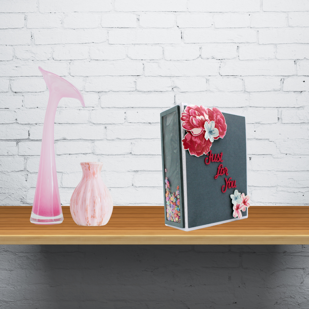
I used some grey cardstock left from making my cards for the frame and stamp packaging for the 'window'
I cut 6 frames so I didn't have to use foam tape which you would see when looking at the front of the box. On one frame I glued the stamp packaging and then stacked the remaining frames on top of this.
 I used some tiny polymer clay flowers as my shaker particles, these were placed in the center of the spine and my frames glued in place over this.


SUPPLIES
Dies: Altenew: HappyThanks, Shutter Cover
          Other: Crafter's Companion Every Day Words (Just For You)
Inks: Altenew Mini cubes - Green Fields , Red Cosmos & Tranquility. 
          Other: Versafine, Versamark,
Cardstock: Neenah Solar White 110lb, Core'Dinations Grey, Tonic Classic Card - Fuchsia, Strathmore Bristol Smooth, Crafter's Companion Glitter, Centura Pearl 12x12in white & various Scratch card.
Embossing Powder: Create and Craft Gold, Hero Arts Clear Embossing Powder.
Other: Collal Glue, Collal Glue Gel, Ranger Multi Medium Matte, foam tape, foam squares, Scor-tape, Crystal Gems, Gold Pearls, Silver Glitter Sequins, Empty Stamp packaging.

And that's a wrap!!! I hope you have enjoyed reading about my final challenge as much as I enjoyed making it. Wish me luck with passing level 1 of the AECP!!

Thank you for taking time to read!


Bunches of Love for Mom

Good morning and Happy Thursday!  I hope everyone is staying warm during this unprecedented cold weather. We are used to it in Michigan but I know the south are suffering.

My design today is bright and cheery, back in UK Mother's Day is on March 14 so I thought I give some inspiration to everyone across the pond. Bunch of Love from this month's new release is a perfect digital image set for this and I paired it with the sentiments from Cup of Joy as this has some sweet Mothering Sunday phrases:


The image was printed twice and the sentiment once, the gorgeous roses were colored with Copic makers I also colored just the bow from the second image, both bunches were fussy cut taking just the bow from the second image.

I stenciled a piece of cardstock with a leaf pattern, matted a card base with coordinating blue card and added my stenciled panel. The roses were shaped and added to my card with glue gel to give dimension. After cutting with a tag die my sentiment was adhered in place. Finally I added the pieces of the second bow, using foam squares and glue gel to give shape.


You can see in this photo the dimension I achieved.

Thank you for stopping by. I will be back during the month with more inspiration from Joy Clair. Also my teamies will be sharing with you over on the Joy Clair Facebook Group.

You can check out the new release and all of Joy Clair's products over in their store.


Wednesday, February 17, 2021

Altenew Educators Certification Program Level One challenge Part 1

 Good Morning, if you have been following my blog you will know that I am working towards Altenew's Educator's Certification. I have completed all my level one classes so this post is the first part of the level one challenge I have been given. I have to make His and Her card sets packaged as gifts. Using components of 3 of the level one classes I have taken. I also have to make packaging for these cards which I have decided to make boxes.

I chose to use layering, ink blending and shine for my class components. I usually lean towards clean and simple cards so ink blending pushes me out of my comfort zone, I love the layering stamps Altenew makes so that was a given for me and shine is often something simple on a card that can make a big difference to the final composition.

I chose to make my cards in groups of 2 and did 8 for each set. I used the same main stamp set and colors across all the set, making each group of 2 individual.

Today I am showcasing the Male set I have designed. I will list all the supplies at the end of my post but I have used Big World Stamp Set across all the cards and chose yellow and grey as my color scheme. I used sentiments for Father's Day, thanks and either Anniversary or encouragement.


My first two cards are Father's Day cards:


I started simple with inks and a blending brush


Using inks from the same set I blended ink onto 4in x 5.5in Bristol card pieces starting in the center with light ink working to the edges with the darker color.
Once I had my bases inked and adhered to white A2 bases with foam tape I started to construct my cards using the following:


I die cut 4 circles, 3 from white scratch card and one from Neenah solar white card. 3 frames were cut from scratch card and 1 from silver. I did this for both of my cards.  I stamped my world layers on the Neenah white circles, (I find it easier to die cut then stamp) and then glued all 4 together keeping the stamped one on top. I glued the 3 white frames together then added the silver one. This gives dimension to the parts without using foam tape. I worked out where these were going to be on my bases so I could fit my sentiments around them. I then dusted the cards with an antistatic pad and stamped my sentiments with Versamark. This was then covered with and heat set with silver embossing powder to give my card shine. I glued my shiny stand and world in place and added a few silver enamel dots for extra shine.


My next 2 cards are Thanks that can be used for Father's Day a birthday or just to thank Dad:


I used an embossed resist technique again I used white A2 card bases. I matted these with grey and yellow card stock. I cut 2 pieces of Bristol Smooth cardstock to 4x5.25in 


I placed one of these in my MISTI, used my antistatic pad on it and stamped the first layer of each of the globe sides with Versamark ink. I then heat embossed blue embossing powder onto the images. This was repeated for 2nd card. I ink blended each piece, one in grey, one in yellow. The ink resists where the images have been heat embossed leaving them blue.


Once the ink had dried I then stamped the remainder of the layers of the globes in green ink. Each image piece was glued to opposing colored bases, so grey base had yellow topper and visa versa. I die cut the word Thanks 3 times for each card twice from scraps from my grey mats and once in gold cardstock. These were layered up for dimension and added to the center of my cards. I then cut the words "Dad for Everything" from one of the stamps in best Dad. (I often do this so I get the words I need it doesn't stop me using the full stamp in the future.) Using some Neenah Solar white I stamped the sentiment with Versafine ink and heat embossed this with clear embossing powder. This was adhered across the 'Thanks' word. Finally I added some gold pearls. I created my shine on this card with my embossed resist technique and the gold mirror card.


My next cards I thought would make great Anniversary cards for a husband or could stay with Father's Day theme:


For these cards I wanted to add detail with ink blending so I used a stencil to give me the patterned background


I matted 2 A2 card bases with yellow and grey cardstock. then cut 2 piece of Bristol Smooth Cardstock to 4x5.25ins I added masking tape to the top and bottom of these to fasten my stencil in place. for added interest I laid my stencil at an angle. Ink was then blended blended through the stencil starting at the top with a darker shade of yellow and using a lighter yellow at the bottom. I repeated this on the 2nd piece of cardstock with grey ink.

I decided to go for a simple look for the detail on this card.


I die cut 2 circles from Scratch card and one from Neenah for each of the cards. I then stamped the layers of my globe onto the Neenah layer. These were then glued together for dimension. My frame was constructed of 2 layers of die cut scratch card and one of gold adhered together. This was repeated for both cards.
On my stenciled card stock I worked out where I wanted my globe so I could add my sentiment.
I stamped 'you mean the' and 'to me' with Versafine ink and heat embossed this with clear embossing powder to give a shine. I then glued the stenciled pieces onto my card bases.

I added the frame for my globe with glue but wanted my globe more defined so I added foam squares to this to make it higher than the frame. Finally I die cut 'world' from gold cardstock and added it across my globe.


My Final cards are a generic male card, it the current climate I like to think the cards I send contain the hugs I can't give:


For these cards I ink blended the back piece and made shakers over this


I started by die cutting 2 pieces of scratch white card stock with the shutter die. While this was going through my die cutter I inked blending 2 A2 pieces of Bristol Smooth card one in yellow and one in grey. 
I used the globe die to cut a circle into the top left of both yellow and grey pieces of A2 cardstock. I then adhered my die cut pieces onto some plastic stamp packaging to make my shaker window. this was in turn glued to my colored cardstock so I has a circle window. 
Finally I added a few silver glitter sequins to the area on my ink blended card that would have the shaker. I used Foam tape to adhere the top part of my shaker to the bottom.
You can see them in the photograph below.


I glued all of this to A2 card bases. I die cut 2 globe piece from Neenah Solar White and 2 Frames from Glitter card stock. The globe layers were stamped on to the Neenah and my stand and globe were arranged on the lower right of my card - balancing the design with the shaker element.
I stamped the sentiment directly onto my card fronts and added a few sequins for shine.


That was all my cards made I now had to make packaging for them to be presented in. 
As I said earlier I chose to make boxes for this purpose. I decided to make magazine holder card boxes from a pattern I have on my Silhouette. This was big enough to hold all six cards and their envelopes.


These are simple to make and give a lot of protection to the cards and envelopes they contain.

I started with 12x12 in white card stock and cut the box pieces from this. To make it coordinate with my cards I decided the magazine holder part would have yellow mats and the outer box grey. Again these were cut on my cameo.


I adhered my mats to the box pieces before constructing the 2 box parts. The inner and outer box parts both have 2 sections which I fastened together with double sided tape. I decided to decorate the outer box to match the cards


I die cut 2 circles and 2 frames with white scratch cardstock then another circle from Neenah cardstock and a frame from silver mirror card.
I stamped the globe onto the Neenah and as I had done with my cards I layered this onto the white scratch circles. The silver frame was added to the white ones too.
I then die cut the words 'Just For You' from yellow cardstock 3 times and layered these on top of each other. These were then arranged on the side of the box. 
Each card set also has to have a recycled element to it. I achieved this with the scratch card I used through out. However I wanted to add more. I used the clear packaging from the stamp set and some scrap pieces of the grey cardstock to make a shaker on the spine of the box.


Using my cameo I cut 6 frames from the grey card. Onto one of these I adhered a strip of the clear packaging. On top of this I glued the remainder of the frames, so instead of using foam tape I used cardstock to give my shaker depth. I stood the box up on it's opening with spine facing me and poured some yellow and silver sequins along the length. I then carefully placed my frame over this gluing it in place with double sided tape.


If you have made it this far I hope you have enjoyed my post - keep the look out for part 2- my female card gift.

Supplies:
Dies: Altenew Big WorldThanks, Altenew Shutter Cover & Crafter's Companion Everyday word (Just For You).
          Other: Versamark & Versafine.
Card Stock: Neenah Solar White 110lb, Core'Dinations grey, Tonic Classic Card Marigold, Strathmore Bristol Smooth, Gold Mirror, Silver Mirror, various scratch cardstock & Centura Pearl 12x12in white.   Embossing powders: Create and Craft Blue, Create and Craft Silver & Hero Arts Clear Embossing Powder.
Other: Collal Glue, Collal Glue Gel, Ranger Multi Medium Matte, foam tape, foam squares, Scor-tape, sequins, pearls, enamel dots, clear stamp packaging.