Hello

Welcome to my blog, a place where I can lose myself in a crafty haven. Pull up a comfy chair grab a cuppa and come and have a read. Oh and if you like what you see, stop by and leave me some love in the comments section

Followers

Wednesday, June 29, 2022

Flowery Critters

 Hello, It's almost the holiday weekend and we are going to spend it with family. All but one of the pups went to their new homes - I will be blogging about the babies next month so watch this space!

My post today is show casing a cute card designed using Maker Forte products. 

Rather than a full post I have recorded a You Tube video, this explains what used to make the card and the process I have followed to complete it:


Here is a list of products I used:

Grovehill Farm Stamp Set

Eclipse Black Ink

Spring Has Sprung Simple Sayings

Simply Stated Dies

Easy Foil Precut Parchment Pockets

Stormy Speciality Cardstock

Top Folding A2 card base

Makers Magic Crystal Clear

Lemon Crown Jewels 


Thank you for taking time to read my blog post.


Thursday, June 23, 2022

Altenew Educators Certification Program - Level 3 -Elements of Floral Composition.

 Good morning! I haven't done any of my AECP classes recently but school's out and the puppies are leaving us over the next couple of days so I will have a little more free time. 

I'm finding the heat too much to cope with with my illnesses so I spent Monday watching the lessons from Jaycee Gasper's Elements of floral composition. I loved this class and I'm sure it will be one I will return to many times. 

So today I decided to put what I have learned in to practice. I have made 2 cards from this class. The first one I chose to use the Space lesson:


As Jaycee eloquently put it "empty space is important - the stars can't shine without darkness. I prefer my designs to have open space so this theory is easy for me to follow.

There is a mathematical approach to space in art and using the rule of thirds is one way. For this you divide your canvas (card surface area) into 3rds like so:


To make the card more aesthetically pleasing you use the cross points for your design. I positioned my Build-A-Flower Tree Peony at the lower left cross point so my sentiment could go on any of the remaining cross points. The flower is quite a large one so I decided to place my sentiment in the top right cross point.


The sentiment is from Fresh Freesia stamp set. I do like to mix up the sets to fit with my theme.
As you can see I also added some splatters to the card before adhering my flower and stamping my sentiment. This is a new technique for me, I usually like a clean card but am trying to come out of my comfort zone. I did trim a small strip from the cardstock so I could add further detail.

Finally I added a piece of purple stripe wash tape to the fold edge of an A2 card base and adhered my floral topper with foam tape for dimension.


As I enjoyed the classes I decided to do a 2nd card using 3 other elements Jaycee explained. Form, Line and Texture.


 I started by stamping Build-A-Flower Giant Bellflower in black ink. Using a black fine liner I accentuated   the lines of the flower and leaves where there would be shade which gives the image a depth. I decided after I had done this to use the solid leaf stamp to give some further detail.

Jaycee explains that flowers inadvertently face upwards which can drawn the eye in a line from them. This is not the case with this stamp, however the stem does as you can see from my map:


Once die cut the white of the flowers seemed to get lost on the white cardstock so I decided to change this to a cream cardstock and added some ink blending under the flowers and splatters to rest of the card piece.

The blue straight lines indicate how the image can draw the eye to further detail. So my sentiment should be placed following these 


As with my first card I "cross pollenated" my stamps sets and used the Build-A-Garden set for my sentiment.

Another technique Jaycee taught was Form: So adding dimension to your designs. I achieved this by using foam squares under my flower. When using foam you need to make sure that you place enough to stop the design sagging when fed through mailing machines.

The final technique I used was Texture: Adding detail either to your image (embossing or using texture paste can do this) or by adding other textured items to your design give your card more interest and can be used to emphasize an area. For this card I used silver thread and silver bubble embellishments.


Thank you for taking time to read my post, I hope that it has given you some inspiration for your card designing. I would love for you to let me know in the comments.

Build a Flower: Tree Peony
Shop at:
ALT
Build a Flower: Giant Bellflower
Shop at:
ALT
Build a Garden: Magnificent Branch
Shop at:
ALT
Fresh Freesia
Fresh Freesia
Shop at:
ALT
Wisteria Crisp Dye Ink
Shop at:
ALT
Hydrangea Crisp Dye Ink
Shop at:
ALT
Ultra Violet Crisp Dye Ink
Shop at:
ALT
Andromeda Crisp Dye Ink
Shop at:
ALT
Sunray Crisp Dye Ink
Shop at:
ALT
Snapdragon Crisp Dye Ink
Shop at:
ALT
Marigold Crisp Dye Ink
Shop at:
ALT
Frayed Leaf Crisp Dye Ink
Shop at:
ALT
Forest Glades Crisp Dye Ink
Shop at:
ALT
Evergreen Crisp Dye Ink
Shop at:
ALT
Obsidian Pigment Ink
Shop at:
ALT
Lavender Fields Crisp Dye Ink
Shop at:
ALT
Jet Black Crisp Dye Ink
Shop at:
ALT
Elements of Floral Composition Online Class
Shop at:
ALT
Neenah Solar White 80lb
Shop at:
AZN

Wednesday, June 22, 2022

Steeples Up High

 Good morning! How is everyone coping with the heat? I hate the heat and with having a house full of puppies it is a struggle for all of us!

My card today is showcasing some interesting stamps from Maker Forte. They have started a Masculine range called Mister Maker and The Arches & Steeple Stamps are part of this.


My card also utilizes Spot Light Trio Stencil and Into The Unknown Stamp set. I used the negative part of the stencil to blank out spotlights for my stamps to go in. These were held in place with Pixie Spray while I ink blended the rest of the cardstock.

I used Pumice Stone Distress Oxide Ink for stenciling and Maker Forte Flat White for Stamping.

I then reused the main stencil as a mask when I stamped the images. This makes it look as though they are set in the 'windows' left by the negative circles of the die.

My sentiment came from the Into The Unknown stamp set. The Aches and Steeples Stamp set does come with words but I wanted a full sentiment. This was stamped with the Flat White and I brushed Pumice Stone over this so it matched my topper.

Making up the card was simple, I matted a Perfect Fold Slimline card base with brown cardstock. I also matted the sentiment with the same cardstock. Once my topper was glued in place I used foam tape to attach my Sentiment.


Thank you for stopping by, If you like what you see please let me know in the comments.

Wednesday, June 8, 2022

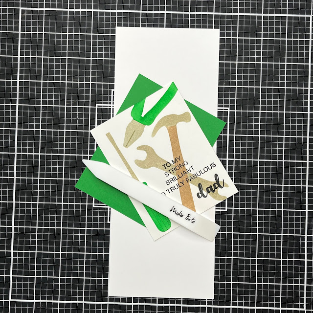
Tools for Dad

 Good morning! We are on the home run for school, summer starts Friday! In the next few weeks Father's Day will also arrive and my card today's inspiration for this holiday.

I have used Maker Forte products for this, both the tool Stencil and the You're Truly Fabulous Stamp Set are perfect.


My design began by me by choosing the products I would be using. I was going to make this a 1 layer card but decided to add a mat to coordinate with the colors of my topper.

My first stage was to stencil the tools. I started with the hammer, positioning my card stock below the stencil I masked off the hammer head and blended Flat White Ink for the handle. Switching my mask around so I could stencil the head in Pumice Stone Distress Ink.


The screwdriver was stenciled using the same technique, British Racing Green Ink was used for the handle. 

For the wrench I wanted it to look as though it was behind the hammer. I positioned the stencil with the wrench across the hammer, masked of the part of the hammer. Blending Pumice Stone through the remaining portion of the stencil gave me the head.


I added detail to the screwdriver handle with a green fine liner and a ruler.


Next I added my sentiment, I love the wording in the You're Truly Fabulous Stamp Set. However feel this a bit too feminine for a Father's Day card. This is an easy fix, by cutting the wording apart. Meaning I could just use the words 'To My Strong, Brilliant And Truly Fabulous'. This doesn't ruin the stamps and they can easily put back together again on a MISTI or an acrylic block.


I chose Eclipse Black Ink for my sentiment. I was stamping over the stenciled image so the black stands out against it.


At this point I decided to add the pliers to my card. It felt I had a bit too much white space at the top of the card. I followed the same technique for stamping this as I did for the screw driver.


Next I built my card, I chose an A2 Top Folding Card Base and matted this with Green cardstock.


I don't like fully flat cards and this one didn't need any embellishments. By using foam tape under my stenciled design it gave some dimension.


Yes I buy my foam tape in these huge rolls which last me forever.


I hope this has given you inspiration for Father's Day. Thank you for taking time to read my post.


Wednesday, June 1, 2022

Dirty and Fun

 Hello! we are back from our vacation which was fabulous - Tennessee is a great 'country style area' So my card today uses the same theme!

Maker Forte have release a great collection pod Western Style products - I will be using these in more cards to come!


Used a few different products for this card, my main aim was to make it looked distressed.


I started by fixing the Rodeo Stencil a piece of Bristol Smooth cardstock. Using a blending brush and  Corduroy Distress Ink I inked through the stencil. 


Using For My Cowboy Stamp Set, I stamped 2 of the boots with Eclipse Black Ink on to white card.


The boots in the set are all different which makes it easy to make pairs of different boots. I wanted 2 different ones to fit with the sentiment I chose to use.

Coloring them with alcohol markers, I used different brown tones both for shading and pattern. Then were then fussy cut them ready for my card.


I stamped the 'If it Ain't Dirty it Aint Fun' sentiment using Eclipse Black Ink and trimmed to size.


Ink blended edges, with the Brushed Corduroy Distress Ink, were added to give it and aged look. Then I used a distressing tool to scuff the edges of both this and my stenciled card. You can use scissors to obtained the same look I just find it easy with this tool.


To make the card look even more distressed I ink blended the roughed edges with the same distress ink.


To build my design I chose A2 Top Folding Card Bases and some dark brown cardstock.


The brown cardstock was used to my base and sentiment then my stenciled topper was added. My boots were arranged and one was adhered flat on the card while the other was placed crossed and fastened in place using foam squares. Finally my sentiment was added a little crooked to fit with the card theme.

Thanks for taking time to read my post, I hope you find some inspiration from it and if you do I would love to see your design.